Color is not merely a visual aesthetic; it is a silent language, a powerful psychological tool that evokes emotions, influences decisions, and shapes perceptions without a single word being spoken. From the moment we open our eyes, color plays an essential and often unconscious role in how we interpret the world. It is the lifeblood of art, the essence of a brand’s identity, and a critical component in the user experience of any product or website. For designers, marketers, and artists, understanding the psychology of color is not just an advantage—it is a superpower.
This comprehensive guide is a deep dive into the fascinating world of color psychology. We will explore the fundamental principles that govern our emotional responses to color, dissect the meanings of individual hues, and provide a practical roadmap for applying this knowledge to branding, web design, and marketing. By the end, you will have a profound understanding of how to harness the power of color to communicate effectively, build trust, and inspire action.
The Foundations of Color Psychology
Before we can wield the power of color, we must understand its roots. Our emotional and psychological responses to color are shaped by a complex interplay of biology, culture, and personal experience.
A. What is Color Psychology?
Color psychology is the study of how different colors and color combinations affect human behavior, emotions, and decisions. It explores the relationship between colors and the mind, examining why certain hues make us feel calm, others make us feel energetic, and still others can create a sense of urgency or trust. It is not an exact science, as responses can vary greatly between individuals, but it is built on a foundation of observable patterns and collective human experiences.
B. The Science Behind Our Response to Color
Our brains are hardwired to respond to color. For millennia, colors have been essential to survival: a vibrant red berry signals a meal, while a sickly green or yellow suggests something is poisonous. This evolutionary programming is why we have immediate, visceral reactions to certain colors. When light hits our eyes, it triggers a cascade of chemical reactions in the brain that affect our mood and behavior. For example, warm colors like red and orange can increase heart rate and stimulate a sense of urgency, while cool colors like blue and green have a calming effect.
C. Cultural vs. Universal Meanings
While some color associations are universal—for instance, red often signifies danger or passion across many cultures—the majority of color meanings are deeply intertwined with cultural context. What is a symbol of mourning in one country might be a symbol of celebration in another.
- In Western cultures, white symbolizes purity, peace, and weddings. In many Eastern cultures, it is the color of mourning and funerals.
- In China, red is a color of luck, prosperity, and happiness. It is used for celebrations and weddings. In some African countries, red can be a symbol of death and mourning.
- Green is universally associated with nature and growth. However, in some contexts, it can represent jealousy or illness.
A skilled designer or marketer must be keenly aware of their target audience’s cultural background to avoid unintended psychological misfires.
A Deep Dive into Individual Colors
Each color has its own unique psychological profile, evoking a specific set of emotions and associations. Understanding these individual profiles is the first step toward creating a powerful and effective color palette.
A. Red
Red is a highly potent and emotionally intense color. It stimulates a sense of urgency and is often associated with passion, love, energy, and excitement. It is a powerful color for standing out and grabbing attention.
- Psychology: Increases heart rate, boosts metabolism, and creates a sense of urgency. It is a dominant color that demands attention.
- Common Associations: Love, romance, passion, power, danger, anger, excitement, urgency.
- Usage in Marketing: Used for Call-to-Action (CTA) buttons to encourage immediate clicks. Brands like Coca-Cola and Red Bull use red to evoke energy and vitality. It is often used in clearance sales to create a sense of urgency.
B. Blue
Blue is one of the most popular colors globally. It is universally associated with tranquility, trust, and stability. It is often seen as a color of logic, security, and professionalism.
- Psychology: Has a calming effect, lowering heart rate and blood pressure. It is associated with intelligence and is seen as non-threatening.
- Common Associations: Trust, loyalty, wisdom, calm, security, peace, sadness (in some contexts).
- Usage in Marketing: Heavily used by financial institutions, tech companies, and healthcare providers to build trust. Brands like Facebook, Twitter, and PayPal use blue to communicate reliability and authority.
C. Yellow
Yellow is the color of sunshine, radiating warmth, optimism, and happiness. It is an attention-grabbing color that is often associated with creativity and energy.
- Psychology: Stimulates the brain and nervous system. It is highly visible and can be a sign of both happiness and caution.
- Common Associations: Happiness, joy, optimism, energy, caution, cowardice, intellectual activity.
- Usage in Marketing: Used to grab attention and create a cheerful mood. Fast food companies like McDonald’s use yellow to evoke a sense of quick happiness. It is also used on warning signs and road signs due to its high visibility.
D. Green
Green is the most restful color for the human eye. It is inextricably linked to nature, growth, and renewal. It is a color that signifies health, wealth, and environmental responsibility.
- Psychology: Creates a sense of balance and harmony. It is calming and stress-reducing.
- Common Associations: Nature, environment, growth, freshness, wealth, health, jealousy.
- Usage in Marketing: Brands that want to project an eco-friendly or organic image use green extensively. Starbucks uses green to create a calming and natural feel. The color is also popular in the wellness and finance industries.
E. Orange
Orange is a dynamic and vibrant color that combines the energy of red with the happiness of yellow. It is often associated with creativity, enthusiasm, and youthfulness.
- Psychology: Stimulates a sense of energy and excitement. It is less aggressive than red but still attention-grabbing.
- Common Associations: Creativity, enthusiasm, warmth, success, energy, youth.
- Usage in Marketing: Popular with brands that want to seem fun and accessible. It is often used for sports teams, children’s products, and creative brands. The color is prominent in brands like Nickelodeon and Amazon’s Buy Now button.
Applying Color Psychology to Design and Marketing
Understanding the psychology of individual colors is the first step. The real magic happens when you combine them into a cohesive palette and apply them strategically to your brand and products.
A. Branding and Brand Identity
Your brand’s color palette is one of its most important assets. It’s the visual handshake you make with your audience.
- Choosing Your Primary Brand Color: This should be the color that best represents your brand’s core values. Is your brand about trust? Use blue. Is it about excitement? Use red. Is it eco-friendly? Use green.
- Creating a Cohesive Palette: A good palette consists of a primary brand color, a secondary color for support, and an accent color to draw attention to specific elements. The colors should work in harmony and reflect your brand’s personality.
B. Web Design and User Experience (UX)
Color is a critical tool for guiding user behavior and improving the user experience (UX).
- Guiding User Behavior: Designers use color to create a visual hierarchy on a page, drawing the eye to the most important elements. For example, a red “Buy Now” button stands out more than a gray one, encouraging action.
- Using Color for CTAs: The color of your Call-to-Action (CTA) button is not a random choice. A well-chosen color can dramatically increase click-through rates. The key is to use a color that contrasts sharply with the rest of the page, making it impossible to ignore.
- Readability and Accessibility: Color choices also impact accessibility. Using a low-contrast color scheme can make text difficult to read, especially for users with visual impairments. Web design must adhere to accessibility guidelines (WCAG) to ensure that color choices do not create barriers.
C. Marketing and Advertising
Color can be used to set a mood, evoke a feeling, and make a product more appealing.
- Color in Product Packaging: The color of a product’s packaging can influence a consumer’s purchasing decision. Brands use color to convey the product’s benefits, such as using green to signify a natural or organic product or blue for a calm and soothing one.
- Evoking Emotions with Campaigns: An ad campaign’s color palette can instantly communicate its message. A vibrant, colorful ad for a toy brand evokes fun and playfulness, while a black-and-white ad for a luxury brand conveys sophistication and timelessness.
D. Interior Design and Retail Spaces
The psychology of color is also a key factor in designing physical spaces, from a coffee shop to a retail store.
- Creating Moods and Atmospheres: A store using a vibrant red and orange palette will feel energetic and fast-paced, encouraging quick purchasing decisions. A store using a blue and green palette will feel calming and relaxed, encouraging customers to linger.
- Guiding Foot Traffic: Retailers use color to guide customers through the store, using bright, eye-catching colors to highlight sales or new products.
The Science of Color Palettes
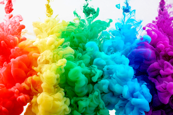
A single color’s effect is powerful, but a carefully curated palette is where the true art and science of color psychology come together. A good palette is a conversation between colors, where each hue complements and enhances the others.
A. Understanding Color Harmonies
Color harmony refers to the aesthetically pleasing arrangement of colors.
- Monochromatic: Uses different shades, tints, and tones of a single color. It creates a clean, sophisticated, and cohesive look.
- Analogous: Uses colors that are next to each other on the color wheel. This creates a harmonious, natural, and comfortable feel.
- Complementary: Uses colors that are directly opposite each other on the color wheel (e.g., red and green, blue and orange). This creates a high-contrast, vibrant, and energetic look.
- Triadic: Uses three colors that are evenly spaced around the color wheel. This creates a vibrant, balanced, and dynamic palette.
B. The Role of a Primary, Secondary, and Accent Color
A balanced palette is typically structured with these three components:
- Primary Color: The dominant color of the palette.
- Secondary Color: A complementary or analogous color that supports the primary color.
- Accent Color: A vibrant, high-contrast color used sparingly to draw attention to key elements.
C. Psychology of Warm vs. Cool Palettes
The overall feel of a palette can be categorized as either warm or cool, each with its own psychological impact.
- Warm Palettes (Reds, Oranges, Yellows): Evoke feelings of energy, excitement, passion, and warmth. They are often used to create a vibrant, active, and social atmosphere.
- Cool Palettes (Blues, Greens, Purples): Evoke feelings of calm, tranquility, peace, and serenity. They are often used to create a relaxing, professional, or sophisticated atmosphere.
Common Mistakes and Ethical Considerations
While the power of color is immense, its misuse can lead to ineffective design, consumer frustration, or even ethical missteps.
A. Ignoring Cultural Context
This is a fundamental error. Using white for a wedding brand in Japan or a black theme for a celebratory event in China could lead to an offensive and commercially disastrous result. Always research the cultural color meanings of your target audience.
B. Overusing Color
Too many colors can lead to a cluttered and confusing design. When every element is shouting for attention, no single element stands out. This can cause sensory overload and make a website or product difficult to navigate. A minimalist palette with a single accent color is often more effective than a riot of hues.
C. Misleading with Color
Using a green logo and packaging for a brand that is not environmentally friendly is a form of greenwashing. Using a red “warning” color for a trivial notification can cause users to ignore truly important alerts. Be honest and transparent with your color choices to build trust with your audience.
D. The Importance of Accessibility
Colorblindness affects a significant portion of the population. A design that relies solely on color to convey information (e.g., a green button for “go” and a red one for “stop”) can be inaccessible. Always use other indicators, like text or icons, to ensure your design is usable by everyone.
The Future of Color Psychology
As technology evolves, so does our ability to apply the principles of color psychology in new and innovative ways.
- AI and Data-Driven Color Choices: Artificial intelligence is being used to analyze vast amounts of data to predict which color palettes will be most effective for a specific audience and goal. AI can even generate a multitude of color combinations based on a brand’s desired emotion.
- Personalized and Dynamic Color Palettes: The future of color in design is hyper-personalization. Websites and apps could dynamically change their color palettes based on a user’s mood, time of day, or location. A news app might switch to a calming blue palette in the evening or a vibrant red for a breaking news alert. This creates a more intuitive and emotionally intelligent user experience.
Conclusion
Color is a fundamental pillar of human experience, a silent yet potent language that shapes our thoughts, feelings, and actions. It is an art form, a science, and a powerful psychological tool that, when understood and used correctly, can transform a simple product into an unforgettable experience. This guide has journeyed from the foundational principles of color psychology to the specific emotional profiles of individual hues, and finally to the practical application of this knowledge in branding, marketing, and design. We have learned that color is not a trivial detail but a core strategic decision.
The lessons are clear: understand the universal and cultural meanings of color, use it to build a consistent and honest brand identity, and apply it with purpose to guide user behavior and evoke desired emotions. But with this power comes great responsibility. The ethical considerations of color—from avoiding misleading claims to ensuring accessibility—are paramount. A true master of color psychology understands that their role is not to manipulate, but to create a more intuitive, beautiful, and emotionally resonant world.
The ultimate power of color lies in its ability to connect us on a deeper, non-verbal level. In an increasingly noisy and cluttered digital landscape, a well-crafted color palette can be the difference between a brand that is ignored and one that is cherished. It is the subtle nuance, the emotional resonance, and the careful harmony of hues that creates a lasting impression. As we move forward, the collaboration between human intuition and data-driven insights from AI will unlock new dimensions of what is possible with color, allowing for creations that are more personalized, more effective, and more profoundly human than ever before. To master color is to master a language that transcends words, to create a world that feels more real and more vibrant, one hue at a time.


